


CHALLENGE
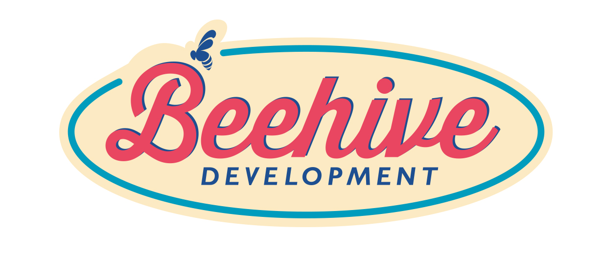
Beehive Development chose an apt symbol for their business—they just got really busy before they had a chance to expand on the visual brand. That made the re-branding process particularly fun all around.
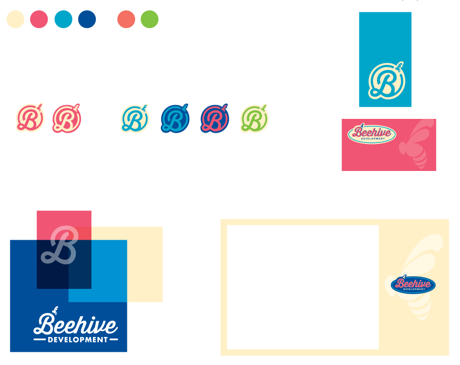
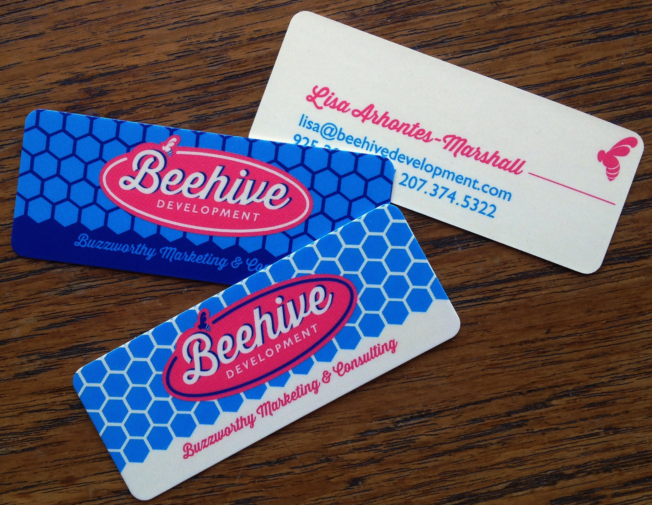
The updated logo was designed to be flexible, incorporating a logo mark and bug icon that could be used in a variety of situations to supplement and/or stand in for the full logo. Combined with a fresh, bright color palette and graphic elements like the honeycomb pattern, the brand is smart and sophisticated and fun simultaneously — all the right ingredients for a successful marketing business.


